Pantone’s Color of the Year is...

A well-loved Pantone fan deck.
The Influence of Color
In our day-to-day lives, we are endlessly inundated with the mostly negative 24-hour news cycle. We need to take active steps to protect ourselves from letting that negativity seep into our mindsets and affect our actions. For example, putting our phones on Do Not Disturb, practicing mindfulness, making the time for self-care, going for walks, etc., are all ways that many people make small adjustments to their day as they strive for all encompassing happiness and positivity. Pantone has identified another factor to consider for our impressionable mindsets: the colors that surround us.
This year, Pantone announced that the 2020 Color of the Year is PANTONE 19-4052 Classic Blue.

Give me Those Blues…
Pantone has many rationales for why they pick their colors of the year, but this year’s pick seems right on track with helping people be calm, ease worries, and combat that negative news cycle that is fighting to stay at the top of our minds.

In its announcement for 2020, Pantone described Classic Blue as: “Instilling calm, confidence, and connection, this enduring blue hue highlights our desire for a dependable and stable foundation on which to build as we cross the threshold to the new era.” An attitude reflected in this quote about the pick from the Executive Director of the Pantone Color Institute, Leatrice Eiseman: “We are living in a time that requires trust and faith. It is the kind of constancy and confidence that is expressed by PANTONE 19-4052 Classic Blue, a solid and dependable blue hue we can always rely on.”
Read on to see why I am so excited about Pantone’s 2020 pick, and how you can incorporate it into your everyday lives (hint: awesome fabrics!).

Classic blue and white ginger jars, tea caddys, and vases add a classic touch to any decor.
“Blue and White Forever!”
— Mike D. Sikes
Personally, I think having a Color of the Year sets a tone and focus for homeowners, furniture designers, textile designers, and -- yes! -- interior designers. For the same reason we all know that acid wash jeans and blue eyeshadow are no longer “socially acceptable,” you wouldn’t choose to install avocado- or mustard-colored appliances in your home or office in today’s design environment. Having a Color of the Year provides a palette to work from and helps eliminate many colors that could make having an opinion or make a strong decision difficult.
When I read the announcement from Pantone this year, my mind immediately started churning with ideas for how to incorporate Classic Blue into my 2020 designs. I couldn’t help but think about Chinese porcelain (Pittsburgh Paint’s pick for 2020) and the timeless combo of blue and white that it features.

As Elizabeth Pash so eloquently puts it in this article: “Blue and white are like Humphrey Bogart and Lauren Bacall--a classic duo that will never go out of style. In design, the color combination goes with absolutely everything--greens, reds, browns, and orange, and of course taupes and other neutrals…”

I just want to sink into this crisp, white sofa and read a good book!
What Chinese porcelain designs really emphasize to me is that Classic Blue is a color that is really meant to be dressed up. On its own, it’s a stunner, but once you add a pop of green or orange, and you’ve created something that is at the same time calming and bright.
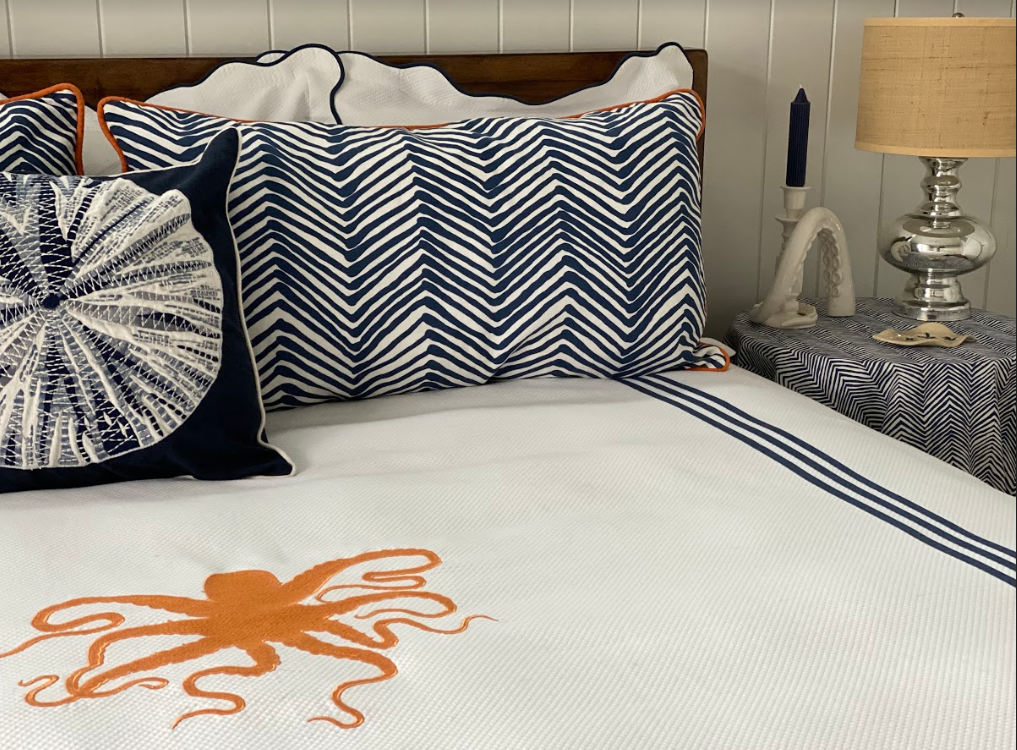
In fact, I used this rule of thumb when designing a bedroom in our beach house. Although there isn’t much of it, the orange used makes an unexpected flare of color in a room filled with Classic Blue.

How many pops of orange can you find in the room? Photo by G. Frank Hart Photography.
The edging on the pillow shams and the table skirt, coupled with the orange waste basket under the Parsons desk in the corner really make the knotty floors and natural fiber drapery panel stand out an otherwise classically blue-and-white beach house room. It adds just the right amount of detail that I love to bring to every room that I design.
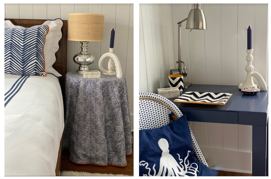
These photos show some of my favorite corners in this bedroom. I love how the table skirt fabric from Quadrille is the same pattern as the pillow sham fabric, just scaled down a bit. I purchased the Parson’s desk from West Elm and had it lacquered with Benjamin Moore’s “Stunning” #826.
As you can see from this bedroom, the fabrics are really where I’ve tied the room together with patterns and, most importantly, colors. The dark blue color is the main event, accented by the white and the orange. Using different patterns on accent pillows, for example, is a way to add a bit of sophisticated flair to your space. Including different patterns of the same color is a great way to introduce variety without looking too busy. Especially since Classic Blue, as we’ve already discussed, is able to serve as a neutral!
One of my favorite parts of design is picking out the fabrics to incorporate into a room -- it’s usually where you can incorporate the most color. I mean, check out all of these fantastic fabrics in this year’s Classic Blue:

via Instagram
Several of the fabrics in this photo are from Schumacher which I’m using in one of my client’s guest rooms. The diamond pattern will be the bed skirt, the pinwheel fabric will be the duvet and pillow shams, trimmed with a red lip cord and accented with small leopard print pillows. Of course that beautiful trim tape is from Samuel & Sons and will look perfect on the bedroom’s roman shades. I can’t wait to see the final result!

Beautiful Blue and White Fabrics for a seating area.

This fabric would look perfect on a chair with an orange pillow on it.
For me, Schumacher is an obvious go-to for blue! The fabric pictured below is one that I hope to bring to a design soon. It’s mesmerizing, and while blue is definitely the primary color holding it all together, I’m in love with how many other complementary colors there are in just this one swatch. Could you see this in a living room for drapery panels or a cute slipper chair?

This dining room featured by Schumacher (of course!) and designed by Shelley Johnstone Design repeats the same pattern everywhere in this room and emphasizes blue and white with the furniture and accessories. This is a perfect example of how blue serves as a neutral--even with all the pattern play here it doesn’t feel chaotic.

Find the fabric here.
Anna-Louise Wolfe agrees with me that patterns are meant to be mixed, and it is really emphasized in her design of this home. The picture on the right demonstrates my point: her bold choice of wallpaper, red lampshades, porcelain lamps, and that beautiful gold mirror all reflect the idea that mixing patterns and fabrics is a great way to emphasize color without it being overwhelming.

A little corner in the same home, with an over-the-top blue and white leafy patterned banquette makes the bright blue in the velvet footstool really stand out. I also love the unexpected pairing of the banquette with the green and red upholstered side chair in the background; pattern on pattern and not just in blue and white. A bold choice that works beautifully. She has transformed an otherwise unusable nook under the stairs into an elegant space. Wouldn’t you love to be sipping a martini and chatting with your best friends here?

Bring Blue Home
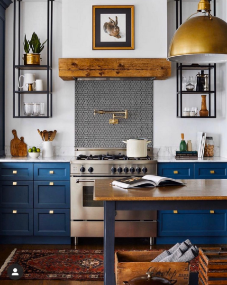
Another way to incorporate this calming, restful color is by making it the main event. Choosing blue as the color for a functional item in a room, like the color of the cabinetry in this kitchen in the February Atlanta Homes magazine below, is an excellent way to make sure that the focal point of the room is the blue without overwhelming the space and leaves room to highlight the metal, wood and stone accents.

Deep blue cabinetry warm up this comfortable kitchen.
The marriage of function and fashion is one of my favorite aspects I bring to my designs, as my clients know!

Is there a way to glam up that front door? Let’s do it!

Need a stool? Let’s make it pop!
Art Deco, anyone?! That velvet and brass stool would be the understated focal point of a room… although I’m not sure it’ll beat out that feather stand ( or is it a light?!)!
Blue kitchen cabinet design is found again here, from Blanc Marine. I love how the brass accents contrast with the solid blue cabinets, but for me, the room really comes together with the red rug. It brings that essence of coziness that kitchens should have -- they are places of gathering with loved ones, after all!
This dining room by Alice Lane Home Collection is much more subtle in its incorporation of blue, but the chairs are essential to pulling the design together. I love the contrast between the rigid steel chair frame and the plush velvet of the cushions. Don’t you think some important decisions could be made at this table?!

Blue velvet contrasts nicely with ironwork dining chairs in this modern dining room.
Are you ready to bring some of Pantone’s Color of the Year into your home or office? This article from HGTV identifies some amazing pieces that could bring the trend easily to your design. Be sure to take a look at some of my other projects to see where you can spot some blue designs (notice anything about the Catherine Jordan Design brand itself!?), and reach out to me if you’re ready to revamp your space to be calm, serene, comforting, and stabilizing.
Subscribe to our blog to get all future posts straight to your inbox!