Spring Greens
“Spring: a lovely reminder of how beautiful change can truly be.”
Now that we have more than a few warmer days under our belts and there is positivity all around (vaccines!), it’s really beginning to feel like Spring: a season for renewal and new beginnings. With both the Spring Equinox (which means rain... which means lush landscapes!) and St. Patrick’s Day this month, I’d say that March’s color is easy to pick: Green!

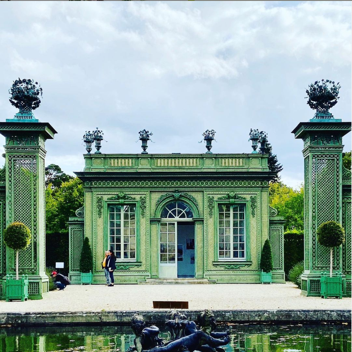
Cowtan & Tout has lots of spring greens to choose from for a cheerful design! Photo.
Today, “green” has become almost synonymous with eco-friendly, sustainable, and “good for you” when it comes to products and food. This carries over to design as well. Green brings freshness and lightness to any space and can be incorporated in more ways than just painting a wall.

Can you ever have too much green? Inside and out this is a beautiful room. Source
I’ve dug into what green means and identified some green design trends that I love. The conclusion I’ve come to: green, in all its meanings, should leave you feeling refreshed, vibrant, and ready to take on the day despite any obstacles. This is an attitude I’m carrying with me through 2021!

What a joyful place this barbershop looks like with its cheery green tiled walls. Source.
The Meaning of Green
As there are many shades of a color, there are also many meanings of a color. Among those meanings there is usually a common thread tying it all together. For green, the common thread that I find is a sense of renewal. Springtime is when leaves start to show up on trees again, the grass becomes vibrant after all the spring rainfall, and new flower buds begin to sprout from the earth. It’s no wonder all of this renewal jump starts in us the desire to spring clean -- we all face the season wanting a new, clean slate after hibernating all winter!

The subtle and not-so-subtle varying shades of green in this sitting area coupled with the nature-inspired wallpaper is refreshing and comforting. Source here.
Of course, for all of us in this past year, we’ve been “hibernating” through all seasons. We’ve been successfully operating solely out of our own homes for these last twelve months and perhaps done a bit more online shopping and less cleaning than we’d like to admit. Now that vaccinations are ramping up and a small sense of normalcy begins to make its way back into our lives, it’s time to spring clean and invite some greenery into our lives.
Renewal & New Beginnings
Cameron Capman author of The Smashing Magazine identifies green as a “down-to-earth” color, representing new beginnings, growth, renewal and abundance. Spring here we come!

I like the idea of waking up in this bedroom in the middle of a winter frost --promises of Spring! Source here.
Digging deeper into color theory, green, a result of mixing blue and yellow, creates a color that theorists say is earthy and brings serenity. This peacefulness is thanks to its blue hues, but the yellow hues in green bring in the lively and energetic feelings that it can evoke.

Nestled between yellow and blue, green is simultaneously calming and revitalizing. Source here.
I love how green can embody these apparent opposites of the serenity of blue and the energy of yellow. This is true in nature as well -- green is the obvious pick for the most earthy color and I can’t help but think about how nature really knows what it’s doing with its color palette: blue skies, yellow sunshine, and lush greenery go together beautifully to make the perfect spring day!

This living room from Elizabeth Hay Design incorporates varying shades of green, blue, and a touch of yellow to create a fresh and comfy space. I feel revitalized just looking at it! I love how the green couch picks up the green tiger that stands out boldly against that coppery background. Which, in turn, picks up the inlaid wood of those beautiful stools! A perfect design, in my opinion. Source here.
Pantone’s Interpretation
In 2017, Pantone named Greenery as their Color of the Year. They cited green as being grounding and calming in a time of social and political upheaval… oh, if only they knew what was coming for them!

Source: Pantone. Little did they know that three years later we’d have tumultuous social and political environments tenfold!
Constant throughout Pantone’s explanation of the color and why it was their choice for the year is the coupled feeling of calm with rejuvenation that this powerful color brings. We’re in a time of even heavier social and political turmoil, which is perhaps why this Spring and all the green bursting forth feels even more refreshing and much-needed than usual.
St. Patrick’s Day
I’d be remiss to write a whole post about the color green in March without mentioning the St. Patrick’s Day holiday! My father was of 100% Irish descent and he pops into my head more often than usual during this green month of March. The holiday is fun all around the world and I always have a little celebration of my own; even if it is just a day of meetings, I will always wear green on March 17th!
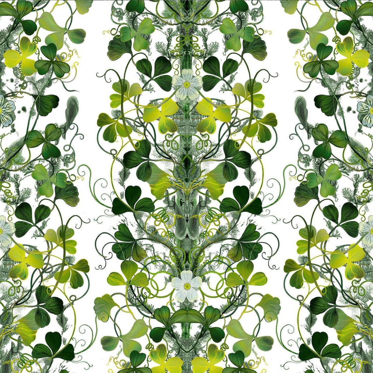
This wallpaper from Timorous Beasties is perfect for the St. Patrick’s Day lover!
Green is the color of Ireland’s lush landscapes, the color of lucky shamrocks, and, of course, is one of the three colors on the Irish flag. If you’ve ever been to Ireland you will see why the color green is synonymous with this country.

The natural beauty of Ireland is breathtaking and only made more so by all of the natural green hues everywhere you look. I took this photo of the tranquil and beautiful Huguenot Cemetery (dating from 1693!). It is located just off of St. Stephen’s Green (!) in the middle of the city of Dublin.
Read more about this fun and interesting holiday here.
Sustainability
Eco-friendly, environmentally conscious, sustainable. These are probably some of the first thoughts or words that come to mind when you hear “green” these days. Which is no surprise! The Green New Deal? About actions we should take to reduce the effects of climate change. “Green tech”? New technology developments to enhance sustainability. Green jobs? Careers or jobs that pertain to creating a more environmentally friendly world. Green thumb? A good gardener! And the list goes on…
The natural, earthy feelings that green brings up make it a good choice for these initiatives, not to mention that nature has many greens to brag about!

Ireland isn’t the only country that boasts lots of natural green. I snapped this shot of Scotland’s beautiful landscape during our 2015 trip. How many shades of green can you pick out?!
The combination of nature plus the ideas of renewal and rejuvenation makes green the perfect color for eco-friendly initiatives. We are trying to revitalize our planet’s natural systems!

The bluish-green of this laundry soap ad from Kind Laundry is calming and evocative of the natural world we are all working to save with our small eco-friendly everyday choices.
Green Design Trends
When it comes to design, using green creates balance and harmony to whatever you are creating. According to articles detailing the effects of different colors, green is one of the easiest on the eyes. Perhaps because it reflects so much in our natural world!
Because it has many calming, grounding, and easeful effects, green is a great neutral color to begin building out a room. Recently, I’ve noticed a trend for green painted walls in living rooms, family rooms, even baby rooms.
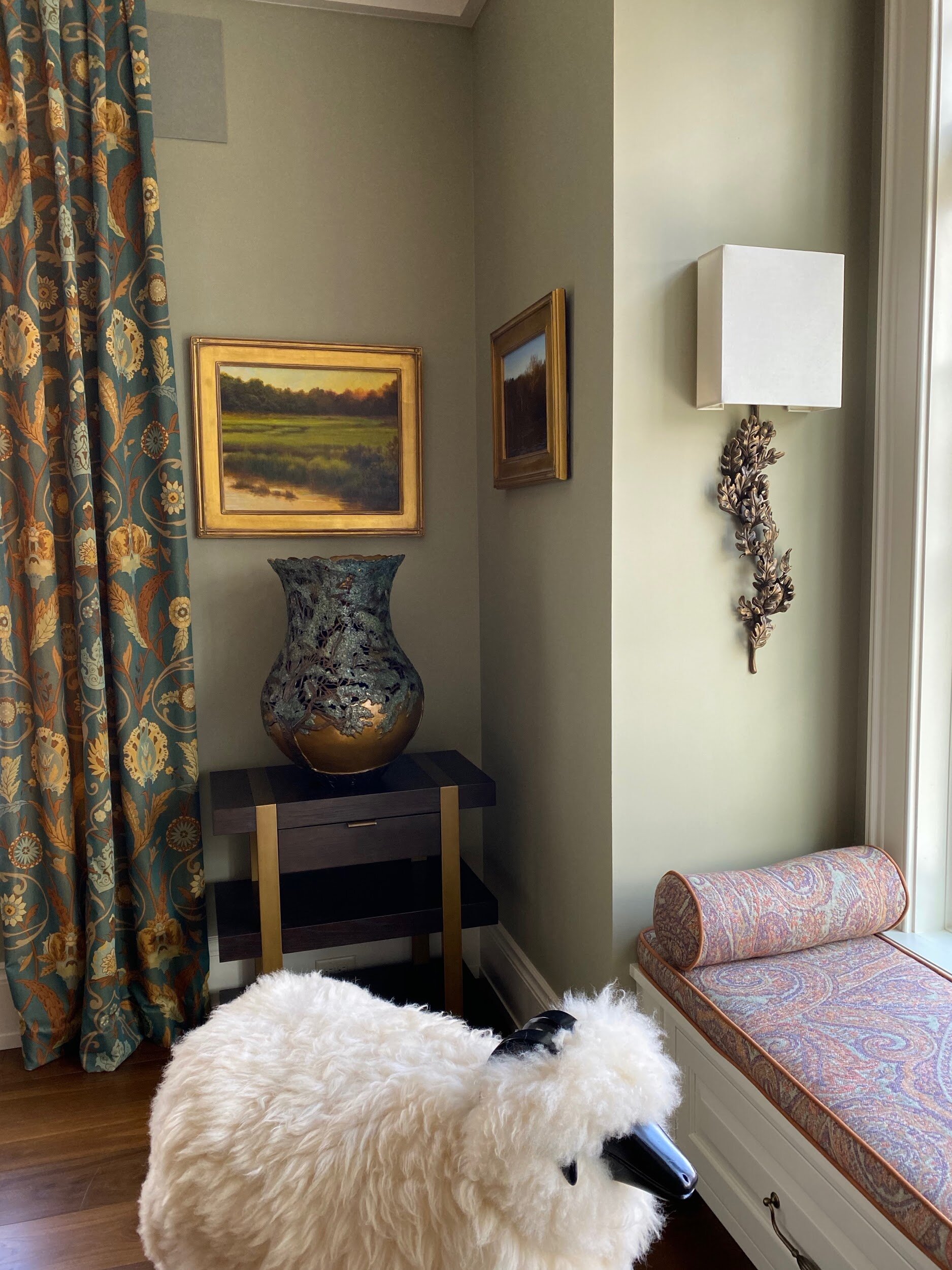
This little sheep in our family room is also featured in a recent blog post here!
Our family room in Richmond is painted Benjamin Moore’s Nantucket Gray. Fun fact: this is a favorite green of White House Interior Designer, Michael S. Smith. He describes this as “the color of wet raincoats”. I think we can agree that your typical raincoat does go with everything! For me, this beautiful green acts as a blank canvas to layer art, furniture, and other accouterments to create a calming, and cozy space for family and friends to gather.
Depending on the shade, green’s status as a secondary color means that you can easily have it as the anchor of a room’s color palette and bring in accents that complement it through bold furniture colors and funky art. My family room, for example, has green neutral walls with pops of copper, purple, and rust which all complement each other and create a warm atmosphere.

The anchor green of the drapes and lampshades really pick up on the greens in the scenic wallpaper and sets a great base for the gilded console tables, mirrors, and photo frames. Beautiful design from Miles Redd. Source here.
Alternatively, interior color consultant Shannon Kaye (yes, this is a thing) says “You can decorate an entire room with greens and have contrast, drama, richness, and balance. It’s so versatile.” I’m with her! Instead of using a neutral green as just an anchor color, use the many different shades of green to contrast and bring in a well-rounded feeling of calming stability and revitalization.

This gorgeous corner from Brad Ford has several different shades of green and not too many other colors. From the walls to the carpet, the couch to the mural, to even the greenery in the vase on the table, all of it is green yet it’s not overwhelming. Source here.

The emerald neutral in this corner allows the pink lampshade to really stand out and pick up the pinks in the trim of the chaise. Source here. Photo by Kip Dawkins.

Green acts alongside black and white as a pop of color in this funky room from Martyn Lawrence Bullard. It really makes those red accent pillows stand out! Source here.
My Kind of Greens
Green is a classic color and appropriate for any room, which is why it has been one of my go-to choices for several of my designs. One of my favorites being right here in my Richmond home, our back kitchen! In addition to using green in our family room, I used green in our back kitchen to tie together our main kitchen space through to my office.

I used Benjamin Moore’s “Palm Trees” for the cabinetry in our back kitchen.
This vibrant green definitely stands out, but it doesn’t steal the show. It leaves space for the various glassware, cookbooks, and bar accoutrements to be dazzling. The bright green also bridges the color wheel of our blue/black kitchen cabinetry and my blue/green office island. It’s all about sight lines!

Looking from my kitchen into my office you can see how the green in the cabinetry of the back kitchen ties to the teal blue green in my office cabinetry to the blue-black cabinetry in our main kitchen.
In our working back kitchen, I knew I wanted to create a cozy yet elegant atmosphere to complement our warm, spacious kitchen on the other side of the wall. I don’t think it’s only the bar that makes this corner of the kitchen the point where friends and family congregate during parties!
Recently, a favorite client needed to upgrade her cinderblock-walled back garden in the Fan District of Richmond. Painting the cinderblock a black/green and covering it with a custom black/green painted trellis created the perfect shade of green that looks beautiful on its own as well as show off her border beds.

Let’s Get Started
Are you thinking of bringing some green into your life this spring? Get in touch with me and let’s start planning!
Subscribe to our blog to get all future posts straight to your inbox!